
"Decor 8" a large design blog with a huge readership has
teamed up with "Fabulous Stationery" a wonderful, hip
stationery co. with over 350 contemporary and funky designs.
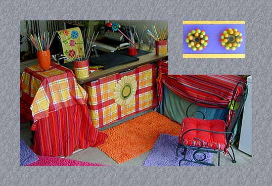
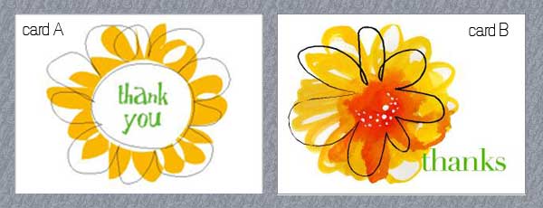
Our task is to photograph our workspace and then choose the
ONE notecard from the stationery line that most "represents"
our space. So here's where I need your help. Both the daisy cards
pictured above are good choices but one has to be chosen as the
"it" card. Tell me what you think. Card A on the left or card B
on the right? Submissions have to made by next week.
By the way besides a blogger I am also a lampworker (torch glass
to create beads as pictured above). The picture is my corner in the
garage where I work. I decided to go retro with my theme
being "flower power".
So let me know what you think. I can't decide. Thanks in advance, k
14 comments:
hi karen! my first instinct was to say go with the red, but after looking at the pictures a little more, i think the flower in the first card feels more like your (fantastic) space. i think it's the circle in the flower that's doing it for me. it's there on your desk and in card a, but only suggested in card b. likewise, your desk and card a both have the flower front and center, whereas card b has it positioned off to the side. either way though, i think you've picked two really great cards. which way are you leaning?
It's a tough call, because both are pretty spot-on. But if I had to choose, I'd go with card B becasue of the red splash in the middle. I think it goes well with the colors in your work space. What a fun contest!
sheesh! That IS a tough call! I don't think you could go wrong either way - they're both so close and totally go with your workspace, but I've decided to settle on Card A. The colors in B are right-on, but the "feel" of Card A just seems to fit more to me too. Good luck!
I think B for sure...it ties in with the red in your space. Love your work space, too!
A for sure!
Yikes. We have a real debate going here. Keep em coming. k
Ooo, tough one. But I think for sure, card B...
..it is the a-symmetrical layout that works best with your space {the pots with your glass cane, and your rugs are not totally symmetrical in the space either}, but mostly the way the brown tone of the flower mixes with the yellow. Evocative of molten glass...which leads me back to you and your space! ;)
{ i think it is aesthetically more pleasing in it's own right too.}
good luck with the comp! :D xx
Hi Karen,
Thanks for inviting me to help you decide on your choice of card for the contest.
First and foremost I just love the palette of bright reds & yellows & the floral elements in your workspace.
I would personally go with Card B because the colour red and the strokes somehow represents the creativity in you.
All the best.
hmmm. i'm voting for card b myself. it strikes me as a little more colorful/artistic/creative, like your space.
i wonder if they have a card that represents a pile of magazines, bobbins, papers and other junk? i'd be a shoo-in. good luck!
tough call indeed... if i was to coordinate, i'd go A, but since the card is to "represent"- then I'd go B, since it has the red as well as the green...good luck with the contest!!
I vote for card B. Aesthetically, it's more funky and the colors tie in more closely to your space.
My main reason for picking B though is because you strike me as somebody who would color outside of the lines - doing the things you want to do and loving the things you want to love and just having fun being unique!
Good luck in the contest :)
Erin T
They're both wonderful, but B caught my attention right away. Carol
Bit late on this one sorry, but I would have gone with B too. Both great choices, but like many others have also said, the splash of colour seems to reflect your creative workspace a bit more. Great space btw! Love the colours!
x
How cute is your studio? It puts mne to shame!!
Post a Comment